One victory doesn’t get rid of years of misery. But it helps.
When it comes to fan misery, Detroit as a city has no peer. Detroit was clearly at the bottom of average winning percentage table (see link to previous table), but are they really that much worse than other cities? In a word, yes! Why?
This paragraph will try to bring some validation for the previous assertion. For those of you that are not statistically inclined, you may want to skip to the next paragraph. Otherwise, what follows is a very brief lesson in statistics. Statisticians use many statistics to describe numbers, but perhaps the two most common are the mean and the standard deviation. The mean simply describes the average of all of the numbers being observed. The standard deviation provides information on how much variability is within the numbers being observed. A low standard deviation for the entire population means the numbers are closely clustered around the mean, while a high standard deviation indicates the numbers are more spread out. Standard deviation also provides information on how far away certain numbers are from the mean (average), and thus how rare a certain number is in relation to the rest of the numbers.
Given this understanding, the mean and standard deviation for the thirteen numbers (the entire population) in Table A, are .506 and .059, respectively. Table A also provides the number of standard deviations above or below the mean for the individual city winning percentages.
| 4-Sport City | Average Winning % | Standard Deviation |
| Boston | .607 | 1.73 |
| Philadelphia | .546 | 0.70 |
| Los Angeles | .539 | 0.59 |
| Minneapolis | .532 | 0.45 |
| Denver | .532 | 0.45 |
| Dallas | .529 | 0.39 |
| Miami | .523 | 0.29 |
| San Francisco | .520 | 0.25 |
| New York | .485 | -0.35 |
| Washington DC | .468 | -0.64 |
| Chicago | .468 | -0.64 |
| Phoenix | .459 | -0.79 |
| Detroit | .364 | -2.43 |
Table A: Winning % over the past five years including standard deviation
The table reveals several interesting observations. First, Boston is the only city with a winning percentage greater than one standard deviation above the mean. More on this Boston “non-misery” in future articles. Second, the separation between Boston and Philadelphia is quite substantial at a little more than one standard deviation. Third, Detroit is the only city with a winning percentage greater than one standard deviation below the mean; in fact it is more than two standard deviations below the mean. Finally, the separation between Detroit and Phoenix is 50% greater than that of Boston and Philadelphia. One might certainly conclude that Detroit has been worse than Boston has been good, and Boston has been good!
A familiar graph used in statistical analysis is known as the normal curve, sometimes called the “bell” curve. The normal curve graphs the expected probability of occurrences based on the mean and standard deviation of the population. Based on the shape of a bell curve, most of the occurrences happen close to the mean with fewer and fewer occurrences as you move further away from the mean. Chart A graphs the normal curve for the five-year winning percentage of the thirteen four-sport cities. It provides a nice picture of the data from Table A and as the saying goes, “a picture is worth a thousand words.”
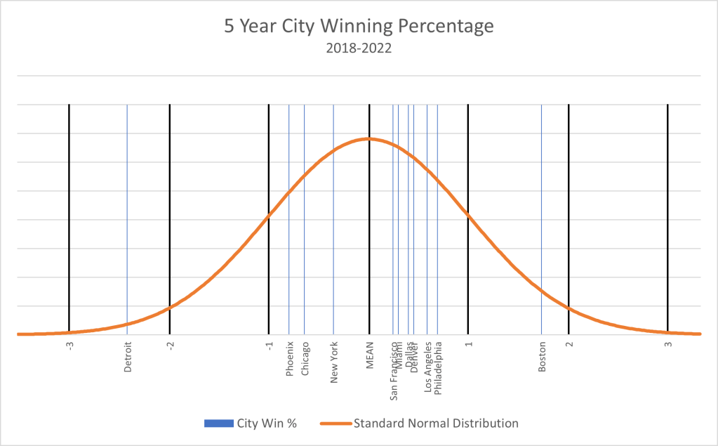
Chart A: Normal curve depicting city winning % over the past five years1
The thicker black bars identify the standard deviations beginning with -3 on the left of the x-axis and ending with +3 on the right. As with Table A, several observations jump out as you look at this chart. First, eleven of the thirteen four-sport cities lie between -1 and +1 standard deviations. This is quite “normal” with not much of interest to discuss regarding these cities. This is not to say that specific teams within these cities don’t have something of interest to reveal, but in terms of five-year daily misery, these cities are where we would expect them to be. Second, Boston has had a really good five-year run. We will find out it is not their best five-year run (once again, subject of a future article), but it is still very impressive. To provide a bit of context, we would expect a city to top this winning percentage about 4% of the time. Finally, we must look at our city that almost reaches “outlier” status. Given the data, we would expect a city to have a worse winning percentage than that of Detroit less than 1% of the time. Simply more objective and relative data to validate that no city can come close to the most recent five-year daily misery dished out by Detroit sports teams.
The next several articles will look at this “no-brainer” claim from other perspectives as we develop and expose the additional components of the fan misery index. Perhaps Detroit will fare a bit better in other city misery aspects and/or we will find some teams/cities that share a similar misery justification.
_______________________________________________________
1 Minneapolis is not shown in this chart since it has the same five-year winning % as that of Denver. So, think of seven cities located between the mean and +1 standard deviation. Washington DC is also not shown in this chart since it has the same five-year winning % as that of Chicago. So, think of four cities located between the mean and -1 standard deviation.
