Our previous articles have focused on one aspect of the fan misery index—the five-year winning percentage component of the city daily misery. This component clearly identified Detroit fans as those who could stake the claim as being the most miserable. Although not analyzed as much, it also identified Boston sports teams as having had an incredible run relative to other 4-sport cities. But this is only one component of a multi-faceted index. Let’s take a look at ten-year winning percentages and see if this component validates earlier observations or if it reveals some new high misery participants.
Table A provides the average winning percentage for each of the 4-sport cities over the past five years (2018-2022) and ten years (2013-2022). The cities are listed in descending order according to their winning percentage. So, in terms of fan misery, the further down the list equates to higher levels of misery. Also, Chart A graphs the normal curve for the ten-year winning percentage of the thirteen four-sport cities.
| 4-Sport City | 10-year Average Winning % | Standard Deviation | 4-Sport City | 5-year Average Winning % | Standard Deviation |
| Boston | .614 | 2.40 | Boston | .607 | 1.73 |
| Los Angeles | .541 | 0.71 | Philadelphia | .546 | 0.70 |
| Dallas | .532 | 0.50 | Los Angeles | .539 | 0.59 |
| Denver | .524 | 0.33 | Minneapolis | .532 | 0.45 |
| San Francisco | .524 | 0.33 | Denver | .532 | 0.45 |
| Minneapolis | .516 | 0.15 | Dallas | .529 | 0.39 |
| Miami | .512 | 0.05 | Miami | .523 | 0.29 |
| Philadelphia | .509 | -0.03 | San Francisco | .520 | 0.25 |
| Washington DC | .503 | -0.16 | New York | .485 | -0.35 |
| Chicago | .477 | -0.77 | Washington DC | .468 | -0.64 |
| New York | .475 | -0.81 | Chicago | .468 | -0.64 |
| Phoenix | .469 | -0.94 | Phoenix | .459 | -0.79 |
| Detroit | .434 | -1.75 | Detroit | .364 | -2.43 |
Table A: Average winning % over the past five and ten years
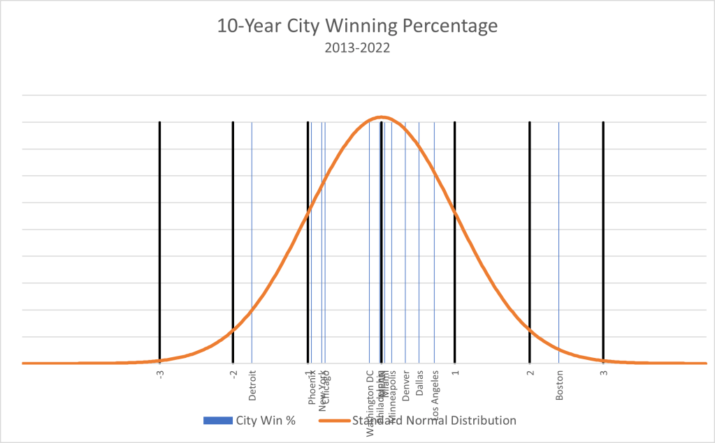
Chart A: Normal curve depicting city winning % over the past five years1
As is our practice, we like to have the data tell the story. First, Boston has maintained an incredible winning percentage over a ten-year horizon. In fact, the difference between Boston and the second highest city (Los Angeles) is higher over the ten-year horizon than the difference between Boston and the second highest city (Philadelphia) over the five-year time period. This is quite unexpected as we discussed in a previous article that as you increase the number of observations, the outliers tend to move closer to the mean. Also, as good as Boston was from 2018-2022, relative to the rest of the 4-sport cities, Boston was actually better during the first five-years of this ten-year period.2
Second, and in keeping with the comments made in the previous paragraph, the daily “non-misery” of Boston fans is hard to overlook. In precisely the same way we argued that Detroit’s daily five-year misery was not even close to any other city, Boston’s ten-year non-misery is not even close to any other city. Chart A provides the best evidence to back this claim as Boston is the only city whose winning percentage is over +1 standard deviations from the mean; in fact, it is +2.4 standard deviations from the mean. To put this in perspective, we would expect a number to be this far from the mean approximately 0.8% of the time. Perhaps unprecedented, but additional historical data would have to be obtained to validate this claim.
Third, Chicago, New York, and Phoenix fans have had a particularly dismal decade in terms of daily city misery. These fans can certainly empathize with Detroit fans. Perhaps the recent rise in fortunes for the Cubs and Diamondbacks during the 2023 MLB season will alleviate some of the misery for Chicago and Phoenix, Unfortunately for New York fans, the Mets and Yankees have been major disappointments based on pre-season expectations.
Finally, Table B adds the ten-year winning percentage for the 3-sport cities. As we discussed in a previous article, we would expect the 3-sport cities to have higher variability relative to those of the 4-sport cities. Therefore, we would expect to see higher highs and lower lows for the 3-sport cities. We see this on the high end with 3-sport Pittsburgh, Toronto, and Milwaukee well above 4-sport Los Angeles. But this also provides yet further evidence of Boston’s extraordinary ten-year run as their winning percentage is still well above that of the best 3-sport city.
Table B also provides insight into the misery claims of Cleveland fans as being the most severe. The data provides ample evidence of misery. It is postulated that other components of the fan misery index will provide additional evidence for Cleveland’s self-proclaimed misery. Branching into other components will be the content of the next several posts. Stay tuned.
| 4-Sport City | Average Winning % | 3-Sport City | Average Winning % |
| Boston | .614 | ||
| Pittsburgh | .574 | ||
| Toronto | .567 | ||
| Milwaukee | .565 | ||
| Los Angeles | .541 | ||
| Tampa Bay | .541 | ||
| Dallas | .532 | ||
| Denver | .524 | ||
| San Francisco | .524 | ||
| Minneapolis | .516 | ||
| Miami | .512 | ||
| Charlotte | .511 | ||
| Philadelphia | .509 | ||
| Washington DC | .503 | ||
| Houston | .494 | ||
| Atlanta | .483 | ||
| Chicago | .477 | ||
| New York | .475 | ||
| Phoenix | .469 | ||
| Cleveland | .464 | ||
| Detroit | .434 |
Table B: Winning % over the past ten years for 4-sport cities and 3-sport cities.
_____________________________________________________________________________
1 San Francisco is not shown in this chart since it has the same ten-year winning % as that of Denver.
2 In order of magnitude, the top three teams that were better during the first five-years of this ten-year period were Detroit, Boston, and Washington DC. The top three teams that were better during the most recent five-years of this ten-year period were Philadelphia, New York, and Minneapolis.
