The Unprecedented Nature of Detroit’s Misery, or Can I Prove My Son-in-Law Wrong?

In the early stages of developing the fan misery index, one of the authors made an off-handed comment that he thought the current misery of the Detroit sports fan was unprecedented. Since this is pretty strong language for statisticians, the author’s son-in-law challenged him to provide evidence that could back up his claim.

Well, several of our previous articles have lent some hints for this “unprecedented” claim, but they have primarily focused on the “not even close” nature of Detroit’s city misery. So, let’s go back a bit in history and see where Detroit’s .364 five-year winning percentage from 2018-2022 falls relative to other cities over different five-year horizons.

We will go back to 2012 and gather all the five-year intervals for each city up to the present. This will provide seven five-year intervals for the thirteen 4-sport cities.1 Therefore, we will have 91 observations—seven for each of the 13 cities. Table A provides the top ten five-year winning percentages and the bottom ten five-year winning percentages dating back to 2012.

4-Sport CityYearsAverage Winning %Standard Deviation
Boston2015-2019.6532.88
Boston2014-2018.6332.49
Boston2016-2020.6332.48
Boston2013-2017.6212.25
Boston2017-2021.6212.24
Boston2018-2022.6071.97
Boston2012-2016.6011.84
Los Angeles2014-2018.5550.93
Los Angeles2017-2021.5510.86
Washington DC2014-2018.5470.76
71 observations falling between .452 and .547
New York2014-2018.452-1.12
New York2017-2021.450-1.15
Phoenix2016-2020.440-1.36
Phoenix2014-2018.439-1.38
Phoenix2015-2019.437-1.41
Detroit2015-2019.436-1.43
Philadelphia2012-2016.433-1.50
Detroit2016-2020.407-2.02
Detroit2017-2021.376-2.63
Detroit2018-2022.364-2.88

Table A: Winning % over five-year time horizons dating back to 2012

Table A highlights some revealing observations. First, the city of Boston has been in a league of their own. The worst five-year winning percentage for Boston sports teams—.601 from 2012-2016—is considerably higher than the best for any other city. Table B provides a list of the highest five-year winning percentage for each 4-sport city and further illustrates Boston’s absolute and relative excellence. More on this phenomenon in our next article as we delve into the ten-year winning percentage component of the daily city misery. The data from Table B also reveals that New York and Phoenix teams could not even muster one five-year stretch of a .500 or greater winning percentage since 2012. Even Detroit was able to squeak out a .504 winning percentage during that time.

4-Sport CityYearsAverage Winning %
Boston2015-2019.653
Los Angeles2014-2018.555
Washington DC2014-2018.547
Philadelphia2018-2022.546
Dallas2012-2016.544
San Francisco2012-2016.541
Minneapolis2017-2021.539
Denver2012-2016.533
Miami2018-2022.523
Chicago2012-2016.517
Detroit2013-2017.504
New York2012-2016.495
Phoenix2013-2017.479

Table B: Highest winning % over five-year time horizons dating back to 2012 for each city

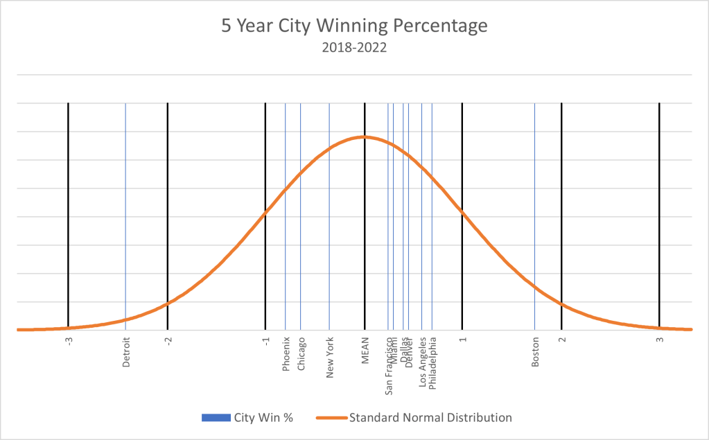
A second observation from Table A seems to point out that the highest five-year winning percentage for Boston may be as unprecedented as the lowest five-year winning percentage for Detroit. Based on the standard deviations being +2.88 and -2.88, respectively, a five-year winning percentage to be greater than Boston or less than Detroit has the same probability of 1/50,000. Table C provides a list of the lowest five-year winning percentage for each 4-sport city. When comparing the data from Table B and Table C, the relative superiority of Boston’s best five-year stretch (.098 greater than LA) exceeds the relative inferiority of Detroit’s worst five-year stretch (.069 less than Philly). Both winning percentages are pretty incredible and a bit unbelievable, albeit for different reasons.2

4-Sport CityYearsAverage Winning %
Boston2012-2016.601
Los Angeles2015-2019.539
Dallas2016-2020.510
Denver2014-2018.504
San Francisco2016-2020.499
Miami2015-2019.489
Minneapolis2012-2016.473
Chicago2018-2022.468
Washington DC2018-2022.468
New York2017-2021.450
Phoenix2015-2019.437
Philadelphia2012-2016.433
Detroit2018-2022.364

Table C: Lowest winning % over five-year time horizons dating back to 2012 for each city

Since the data for this analysis only went back to 2012, I am not sure this has convinced my son-in-law of the unprecedented nature of Detroit’s miserable five-year winning percentage from 2018-2022. But he has admitted that unprecedented or not, Detroit fans have had a bad go of it in recent years. Also, being a Chicago sports fan, he is under the impression that other components of the fan misery index may reveal that Detroit is not the only city, or team, that has dished out a large proportion of misery. To be continued . . .

_______________________________________________________

1 The seven five-year intervals are as follows:  2012-2016

2013-2017

2014-2018

2015-2019

2016-2020

2017-2021

2018-20222 As a piece of information, and providing additional evidence to the unprecedented nature of Boston and Detroit’s five-year stretches, the best five-year winning percentage for a 3-sport city is Milwaukee at .632 from 2018-2022. The worst five-year winning percentage for a 3-sport city is Cleveland at .427 form 2015-2019.

Is it Still a No-Brainer Regarding Detroit’s Misery?; or I Thought Cleveland Fans Had it the Worst!

In our recent posts, we have looked at the winning percentage for each of the thirteen 4-sport cities over the past five years. We also briefly described how this 5-year city winning percentage is just one aspect of a larger concept defined as the Fan Misery Index (FMI).

Our initial conclusion based on this single component of fan misery was that Detroit sports fans were perfectly justified in feeling that their fan experience over the past five years was indeed the most miserable. We also stated that no other city’s misery was even close. Well, one might argue that there are other cities that should be considered in terms of their misery even if they don’t field a team in all four of the major sports. Although comparing four-sport cities with three-sport cities is not an “apple to apple” comparison (yes, we have a footnote here),1 we thought it would still be an interesting exercise to see what the data reveals.

Currently, there are nine cities that have one sports team competing in three of the four major professional sports leagues—baseball, football, basketball, and hockey. Refer to Table 2 in the link provided for a list of these nine cities and their corresponding sports teams. Even though it is currently a 3-sport city, Seattle is not included in this analysis as the Kraken have only been in existence for two years.  Thus, Table A provides the winning percentage for the thirteen 4-sport cities as well as each of the eight 3-sport cities over the past five seasons. The winning percentage is calculated by taking the average winning percentage across all that city’s sports teams over the past five years. The cities are listed in descending order according to their winning percentage. So, in terms of fan misery, the further down the list equates to higher levels of misery.

4-Sport CityAverage Winning %3-Sport CityAverage Winning %
  Milwaukee.632
Boston.607  
  Tampa Bay.601
  Toronto.579
Philadelphia.546  
Los Angeles.540  
  Pittsburgh.537
Minneapolis.532  
Denver.532  
Dallas.529  
Miami.523  
San Francisco.520  
New York.489  
  Charlotte.481
  Cleveland.479
  Atlanta.474
  Houston.469
Washington DC.468  
Chicago.465  
Phoenix.459  
Detroit.364  

Table A: Winning % over the past five years for 4-sport cities and 3-sport cities

Several observations pop out when looking at the data for 3-sport cities and comparing it to that of the 4-sport cities. First, even though we would expect that 3-sport cities would have greater variability in their winning percentages (higher highs and lower lows), we observe this variability only on the high side. The worst winning percentage for 3-sport cities is Houston at .469. This puts them in the same group as Washington DC, Chicago, and Phoenix, but still much higher than that of Detroit. Second, and not much talked about in the national conversation, is that the city of Milwaukee has had an incredible five-year run. Tampa Bay has also had a nice run, very similar to that of Boston. More on these and other “non-misery” city and team experiences will be discussed in future articles. Finally, the dismal .364 winning percentage posted by Detroit teams over the past five years continues to amaze at how robustly bad they have been relative to comparable and closely comparable cities. The robustness, or lack of, this dreary winning percentage will be the topic of our next two articles.

As an aside, in casual conversations regarding our work on the FMI with a variety of people, we often hear the sentiment that Cleveland fans have had the roughest go of it. Perhaps additional analysis may bear this out, but in regard to the most recent five-year daily misery component of the FMI, Cleveland has had it better than six other cities in this list.

_______________________________________________________

1 Two reasons: (a) a statistical phenomenon known as “regression toward the mean” where extreme outcomes tend to be followed by more moderate outcomes.  This suggests that since four-sport teams have more data points, they will tend to have winning percentages closer to the mean than those of three-sport teams; and (b) the mean winning percentage in baseball, football, and basketball is .500.  This is not true for hockey because of the way hockey treats tie games at the end of regulation.  In fact, the mean winning percentage across all hockey teams is roughly .550.  Therefore, three-sport cities with hockey teams will have a higher probability of a higher winning percentage than those that don’t have a hockey team.

Detroit Fans’ Misery—It’s Not Even Close, or Is This Even Statistically Possible?

One victory doesn’t get rid of years of misery. But it helps.

When it comes to fan misery, Detroit as a city has no peer. Detroit was clearly at the bottom of average winning percentage table (see link to previous table), but are they really that much worse than other cities?  In a word, yes!  Why?

This paragraph will try to bring some validation for the previous assertion. For those of you that are not statistically inclined, you may want to skip to the next paragraph. Otherwise, what follows is a very brief lesson in statistics. Statisticians use many statistics to describe numbers, but perhaps the two most common are the mean and the standard deviation. The mean simply describes the average of all of the numbers being observed. The standard deviation provides information on how much variability is within the numbers being observed. A low standard deviation for the entire population means the numbers are closely clustered around the mean, while a high standard deviation indicates the numbers are more spread out. Standard deviation also provides information on how far away certain numbers are from the mean (average), and thus how rare a certain number is in relation to the rest of the numbers.

Given this understanding, the mean and standard deviation for the thirteen numbers (the entire population) in Table A, are .506 and .059, respectively. Table A also provides the number of standard deviations above or below the mean for the individual city winning percentages.

4-Sport CityAverage Winning %Standard Deviation
Boston.6071.73
Philadelphia.5460.70
Los Angeles.5390.59
Minneapolis.5320.45
Denver.5320.45
Dallas.5290.39
Miami.5230.29
San Francisco.5200.25
New York.485-0.35
Washington DC.468-0.64
Chicago.468-0.64
Phoenix.459-0.79
Detroit.364-2.43

Table A: Winning % over the past five years including standard deviation

The table reveals several interesting observations. First, Boston is the only city with a winning percentage greater than one standard deviation above the mean. More on this Boston “non-misery” in future articles. Second, the separation between Boston and Philadelphia is quite substantial at a little more than one standard deviation. Third, Detroit is the only city with a winning percentage greater than one standard deviation below the mean; in fact it is more than two standard deviations below the mean. Finally, the separation between Detroit and Phoenix is 50% greater than that of Boston and Philadelphia. One might certainly conclude that Detroit has been worse than Boston has been good, and Boston has been good!

A familiar graph used in statistical analysis is known as the normal curve, sometimes called the “bell” curve. The normal curve graphs the expected probability of occurrences based on the mean and standard deviation of the population. Based on the shape of a bell curve, most of the occurrences happen close to the mean with fewer and fewer occurrences as you move further away from the mean. Chart A graphs the normal curve for the five-year winning percentage of the thirteen four-sport cities. It provides a nice picture of the data from Table A and as the saying goes, “a picture is worth a thousand words.”

Chart A: Normal curve depicting city winning % over the past five years1

The thicker black bars identify the standard deviations beginning with -3 on the left of the x-axis and ending with +3 on the right. As with Table A, several observations jump out as you look at this chart. First, eleven of the thirteen four-sport cities lie between -1 and +1 standard deviations. This is quite “normal” with not much of interest to discuss regarding these cities. This is not to say that specific teams within these cities don’t have something of interest to reveal, but in terms of five-year daily misery, these cities are where we would expect them to be. Second, Boston has had a really good five-year run. We will find out it is not their best five-year run (once again, subject of a future article), but it is still very impressive. To provide a bit of context, we would expect a city to top this winning percentage about 4% of the time. Finally, we must look at our city that almost reaches “outlier” status. Given the data, we would expect a city to have a worse winning percentage than that of Detroit less than 1% of the time. Simply more objective and relative data to validate that no city can come close to the most recent five-year daily misery dished out by Detroit sports teams.

The next several articles will look at this “no-brainer” claim from other perspectives as we develop and expose the additional components of the fan misery index. Perhaps Detroit will fare a bit better in other city misery aspects and/or we will find some teams/cities that share a similar misery justification.

_______________________________________________________

1 Minneapolis is not shown in this chart since it has the same five-year winning % as that of Denver. So, think of seven cities located between the mean and +1 standard deviation. Washington DC is also not shown in this chart since it has the same five-year winning % as that of Chicago. So, think of four cities located between the mean and -1 standard deviation.